
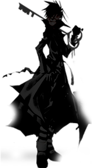
Title pretty much says it all what do you think so far ? what could i do to improve ? its mainly finished just might add a few touch ups and a border again thanks for your time


Results 1 to 6 of 6
Thread: What do you think so far ?
-
07-14-2011 #1
Dead


Join Date : Jan 2011
Location : Climbing a long ladder
Posts : 4,034
Array What do you think so far ?
-
07-14-2011 #2
Kakeh Re: What do you thin so far ?
look very good. all i recommend is doing something better for the text. It takes away from the focus of the sig even though its transparent. My eyes should flow to that colorful glow, it starts ti then BAM. text halfway. text should be secondary if it is not the main point of it
One thing I learned in my Illustrator class a couple of semesters ago is that the eyes should be set on a flow around a piece of art. i am still trying to do that effectively. When you start you should come back to the focuses. here the text interrupts the rest of it while everything but the text interrupts the text itself. look at the demon akuma sig you have. my eyes travel back between Akuma and the text. they both work well together but they do not really bother one another
regardless your piece here looks visually appeasing and good. better than what I can do in many terms, but I believe the text can be worked on
-
The Following User Says Thank You to Kakeh For This Useful Post:
-
07-14-2011 #3
Dead
Join Date : Jan 2011
Location : Climbing a long ladder
Posts : 4,034
ArrayRe: What do you thin so far ?
Yeah i understand what your saying the text kinda comes at you first and distracts you from the surroundings this is why i made it like a glass effect to maybe help with the flow but it still does not feel right maybe if i shorted the text it may help and thanks for your post it was well put and i enjoyed reading it much appreciated Originally Posted by Kakeh

-
07-14-2011 #4
Security


Join Date : Jun 2011
Location : tx
Posts : 1,008
ArrayRe: What do you thin so far ?
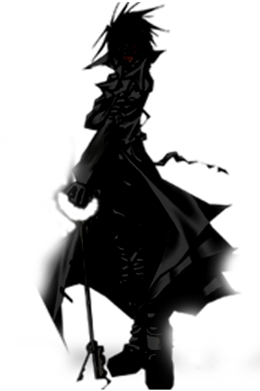
very well done i think if you make a new sig you should try using akumas torso with your name as his bead neclace
if you dont mind how long did that take you to create???
-
The Following User Says Thank You to reapermech For This Useful Post:
-
07-14-2011 #5
Dead
Join Date : Jan 2011
Location : Climbing a long ladder
Posts : 4,034
ArrayRe: What do you thin so far ?
Im not entirely sure as i was on and off creating it and that sounds nice but may be hard for me lol im a noob and thank you Originally Posted by reapermech

-
07-14-2011 #6
Kakeh Re: What do you thin so far ?
Original Boss wouldn't fit on the beads unless you had multiple letters per bead and then it would look cluttered
the trick is getting the letters to look like painted ink or engraved letters and not just text. taking a chalk brush and using it to smudge a black glob into appropriate letters or using a proper font and manipulating the text to look like they belong there is the thing to do. though it wouldnt look right with so many letters. unless you use japanese/chinese symbols wherever Akuma is from to spell out the name

 Reply With Quote
Visitors found this page by searching for:
Tags for this Thread
 Posting Permissions
About 360haven
360haven is an Forum Devoted To Game modding Fans from all over the world.
An Awesome Community of Xbox 360 Gamers, Modders and Developers who Create & Share Tutorials, Applications, Gfx, Trainers and Gamesaves.
A haven for the l33t.
A scarce paradise for modders.
An Awesome Community of Xbox 360 Gamers, Modders and Developers who Create & Share Tutorials, Applications, Gfx, Trainers and Gamesaves.
A haven for the l33t.
A scarce paradise for modders.